
Bohemian
Blossoms
A visual identity for a botanical studio working with dried florals, foliage and pure essential oils, built around one hand-drawn stem and a palette taken from the plants themselves.
A small botanical studio needed an identity that could sit quietly against the product. Arrangements, foliage and oil bottles carry the colour and texture; the branding had to frame them without competing.
One hand-drawn stem became the fixed element. It works alone as a mark, inside a circular lockup for stamps and labels, or beside the wide-tracked wordmark. Three versions cover every surface, from a business card to a curved bottle.
A four-colour system of sage, eucalyptus, warm sand and grey, paired with Serenity for headers and Montserrat for body copy. Delivered as a brand board with stationery, tote and essential oil packaging applied.
Logo suite
Wordmark, stem mark, circular lockup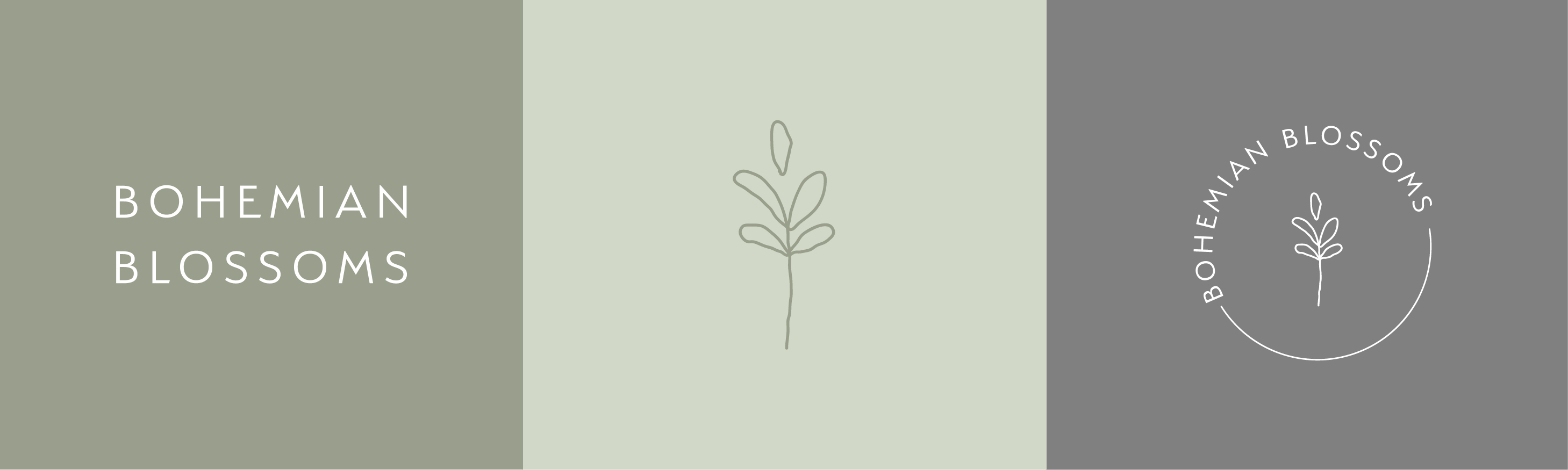

Palette
Four colours, drawn from foliage and dried stems